What Deadpool & Wolverine Can Teach Us About Website Color Scheme
‘Red and Yellow’ is one of the key phrases for this movie. Honestly speaking, it looks great.
Actor Ryan Reynolds playing Deadpool and Hugh Jackman playing Wolverine are travelling the world from South Korea to Germany to promote the film. Everywhere they go, from banners to fan-made art to costumes, there are two significant colors representing the titular superheroes’ costume hue: Red for Deadpool and yellow for Wolverine.
Both the colors in the film’s trailer are also looking great in typography.
This kind of dual color scheme may look good on your website too! Speak to a web development agency in USA and you might find more insights into this matter.
What Is Dual Color Scheme in Web Design
A dual-color combination in website design is simple to understand. You take two different hues, with a little contrast to their nature (so that they are easily recognizable) to design a website. They need not be used in equal proportions. You can play with them. However, they must be relevant to the message you want to share with your audience.
Thing to remember: Dual color scheme in a website means actually using two colors. If you use a color with a white accent or white with the color as an accent, then it becomes a monochromatic color scheme. It is not as same as a dual-color scheme. A dual-color scheme is more defined, direct and vibrant in its effect.
There are more regulations to use dual color schemes on a website though. We, as a professional web development agency in USA, can share more about this with you.
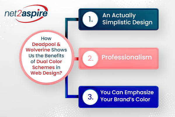
How Deadpool & Wolverine Shows Us The Benefits of Dual Color Schemes In Web Design?
Do you need to use a dual color scheme as the movie Deadpool & Wolverine used? Well, there might be more than one reason to say ‘yes’. We can discuss them in the following points:
-
An Actually Simplistic Design
If you look at the movie color scheme, you will see both the colors red and yellow are maintained in an even order to highlight the characters
And that’s it!
We don’t see any other colors in the movie. Even the texts are written using these two colors making the ‘look’ of the movie basically simple. But the good news it is successful in creating an imprint in the minds of the viewers.
If you use two colors for your website, you keep the overall design minimal. Your website is easy to go through. It’s simple to understand and if you are using the right colors, it soothes the viewers. According to any web development agency in USA, this way helps you create a memorable website. -
Professionalism
The film is a commercial one. The color scheme sticks close to this attribute of the film. It plainly represents the two central characters of the film, indicating what you’re about to see on the silver screen.
This information, although direct, can be considered as defined professionalism. By using two colors on your website, you look more professional, defined, and direct. -
You Can Emphasize Your Brand’s Color
Since red and yellow represent both the titular characters of the movie, it is no wonder that they do justice to the meaning of the film.
If your brand has two colors that signify your business, then you can use them in the right blend on your website.
This is where we can shift a little from the color scheme used in the movie. You see the movie used them in an equal proportion. That may not have to be your style. You can use the dominant color of your brand in a greater proportion. Some brand uses one color as the main color of the website and the other as an accent.

To Conclude
Did you find this information useful? To know more about website color schemes though, you need to talk to a professional web development agency in USA such as us. We can help you choose the color scheme of your website in tons of styles and ideas you might have not known or thought of before.
